QuintoAndar iOS app
Overview
QuintoAndar is the biggest real estate startup in Brazil. It‘s a marketplace where users can search, rent, and advertise properties.
My role
When I joined the company, I was the only product designer in a squad of 8 people focused on the company’s iOS apps.
Goals
- Increase property visits
- Increase property listing views
- Help users save time while finding their dream home
Outcomes
- Increased visit bookings by 24%
- App of the day on App Store
- VoiceOver accessibility
Behind the scenes
QuintoAndar has grown its properties base exponentially in 2018. When I joined the company, my challenge was to increase user engagement on the iOS native app. We decided to focus on the following challenge, so we could increase visit bookings and discoverability:
How might we help tenants save time while finding their dream home on the platform?
Exploratory user research
Because of the tight deadline for shipping the first version, we’ve started with a guerrilla test. I invited one of the developers to help me interview 5 users that have previously rented a house without using QuintoAndar. We asked them to try to find their next home on our iOS app that was available on App Store. Some questions that got asked:
- Have you ever lived in a rented house? Tell me about the experience.
- Have you heard about QuintoAndar before? If so, how would you describe it for a friend?
- How would you choose a property to visit on the app?
Key insights
"What's this number? 2 places or is it on the 2nd floor?"
- Some users didn't understand the meaning of the numbers on the map
“How can I go back from here?”
- Some couldn’t find how to close the carousel
- Others took a great amount of time to realize there was a horizontal scroll on the carousel
“Maybe I would give more information about ... any bus or underground lines around.”
- Some wanted to see more information about public transport for each property
“Are there any history or something similar?”
- They couldn't retrieve properties that they’ve seen before in the map, so they could compare them with new ones
1st round
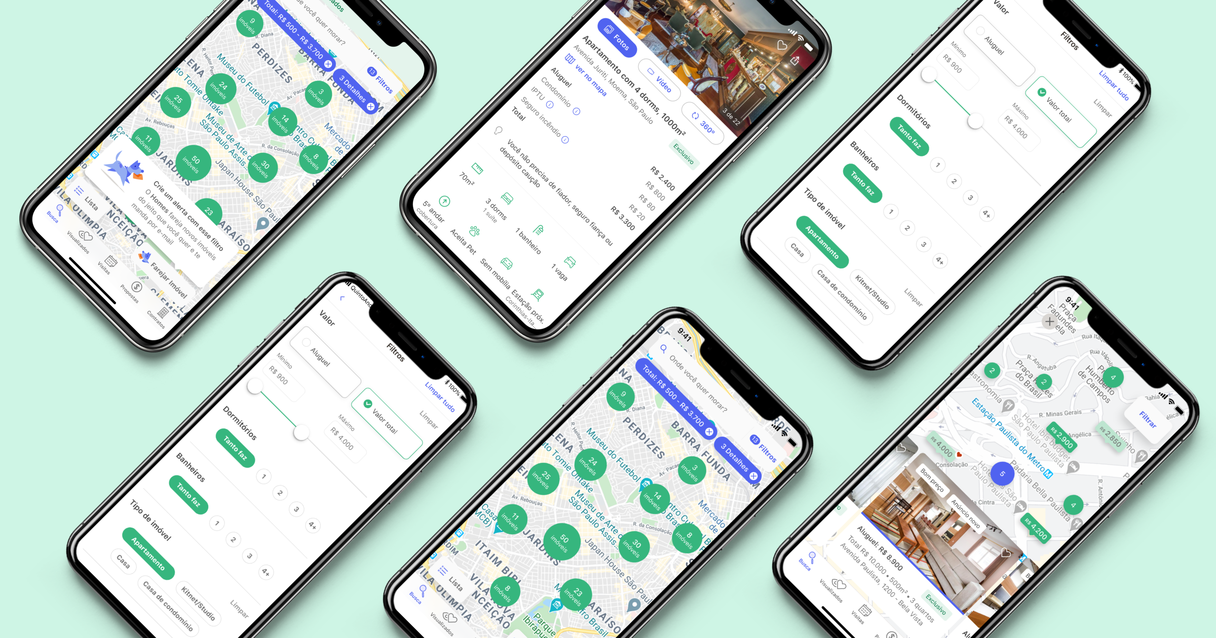
Map navigation
After prioritizing the usability problems we found on user research, we’ve run a competitive analysis with apps related to real estate, accommodation, and maps. We came out with some concepts to give more information to the users while searching through properties on the map.
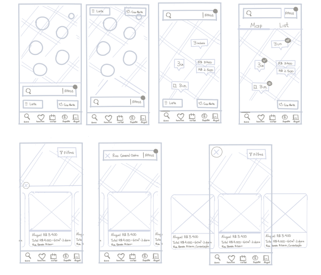
Card sorting
User tests indicated that people still missed an easier way to retrieve properties they viewed, thus we wanted to build a dedicated list. However, we were not sure where to place that feature.
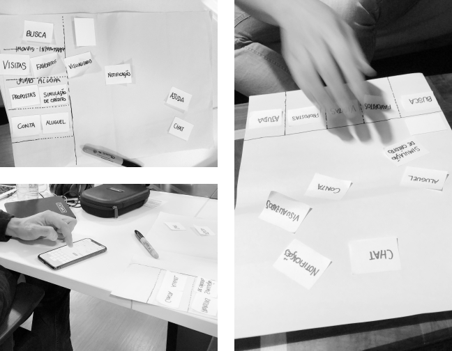
We've gathered some user's contacts and sent an email to them inviting for an interview in person. We've recruited 6 people for a card sorting and usability test session in house, not only to find out where to place this new feature but to grasp how users would organize other features on the app. We've learned that:
- People tended to see this History feature more related to the Favorites section than to their Profile section,
- We needed to change the Favorite section label on the bottom bar to Viewed, otherwise not many users engage with this new feature. The favorite section would be alongside it.
Design Critiques
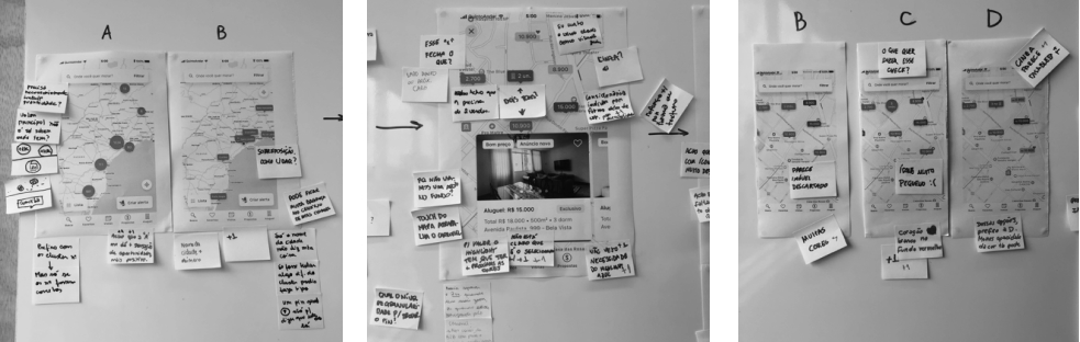
I've presented 3 different visual options alongside a Figma prototype to simulate the panning on the map during a design critique with 7 other design peers. After everyone exposed their thoughts about the visual alternatives, we've come up with a final concept to test:
The concept
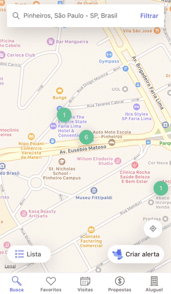
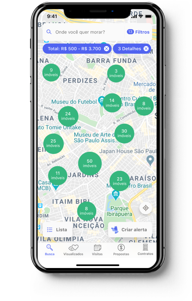
- Pins on the map would display properties prices so people would save time exploring the ones in their price range
- As some people didn’t understand the numbers on the circles in the tests, we’ve added the word "properties" to the clusters, so they would immediately understand the number mean the number of properties in the area.
- Some users didn’t find out that there were more properties to scroll through the carousel in tests. That’s why we’ve improved its affordance so people know there are more properties to scroll through.
- As users scroll the carousel, the map moves to the next property location, so we've increased discoverability and our chances of the users finding their perfect home
- We've added the name of close public stations nearby and a link to show the property on a map, so users would better understand the surroundings of the properties.
- When users favorite a property, the pin on the map displays an icon, and after they visit a property page its pin becomes faded
Usability Tests
Developers decided to code a quick prototype to simulate the interaction on the map as the users would zoom in and navigate through the carousel. After that, we took the prototype to a round of user usability tests.
We’ve recruited 5 more people who have previously rented a house to test our prototype. This is what we've learned:
- People praised the price displayed directly on the map but complained about the time it took to get to the zoom level that would show the prices. Hence, we’ve decided to display price pins for some properties when they were not close to others.
- People couldn’t successfully understand the pins of buildings with more than one property, so we’ve decided to use circles with numbers instead.
2nd round
Filters
The map navigation tests also gave us good insights into how people use filters and their expectations. Thus, we’ve decided to work on the filters controls and improving the feedback about which filters were applied for the next iteration of the design.
- People couldn’t easily find which filters were applied on the map
- People didn't know if the filter was applied to the map
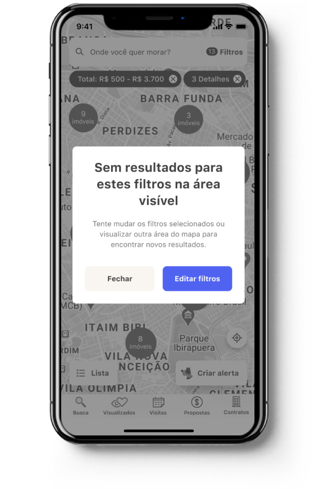
- When people applied too many filters they wouldn't get a message saying there were no results to those filters
Thus, we’ve decided to work on the filters controls and improving the feedback about which filters were applied for the next iteration of the design.
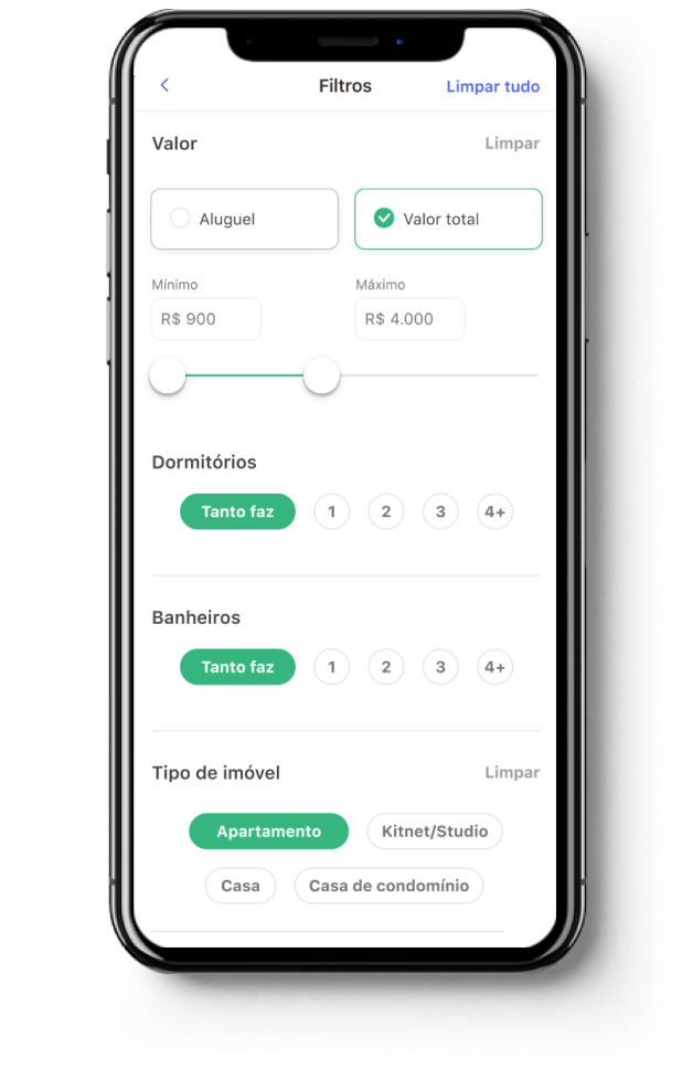
We've enhanced the distinction between rent prices and the full price and allow users to type the price range (not only for accessibility matter but also because users struggled to correctly set the price they wanted)
People got no results when using several filters at once, but there wasn't enough feedback that the filters were applied so they kept waiting for the properties to load on the map. Thus, we've added a message saying no results were found and inviting the user to try other filters
Some users would go back to the map view and forget what filters were already applied, so we made clear which filters paramenters were applied to the map view and made easy for the user to remove any of those
3rd round
Email alerts
With all of the previous improvements we've already reached a good number of visits booking, but we’ve decided to stretch our goal. We concluded that if we focus on improving the Favorites and the Alerts features we could boost visits bookings. Alerts is a feature where users subscribe to regular emails that show them properties that they might like, according to their filters.
From analytics data and user interviews we've learned that even though more than half of the users used those features, there was a good opportunity to increase their adoption.
So we’ve created some A/B tests to learn if some little tweaks would indeed increase visits. We’ve learned that:
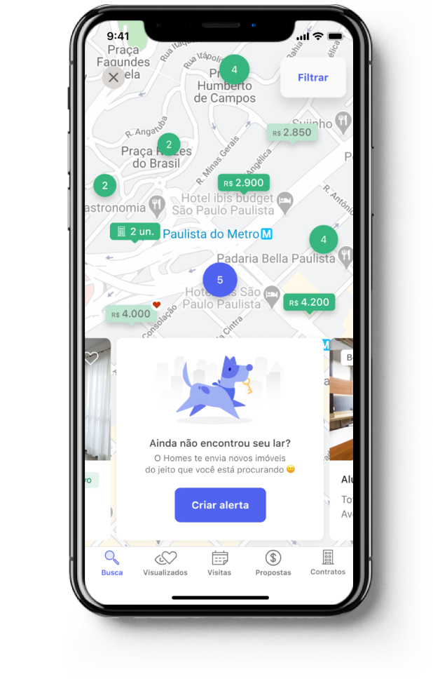
If we showed a suggestion to create an alert in the carousel, we would increase visit bookings.
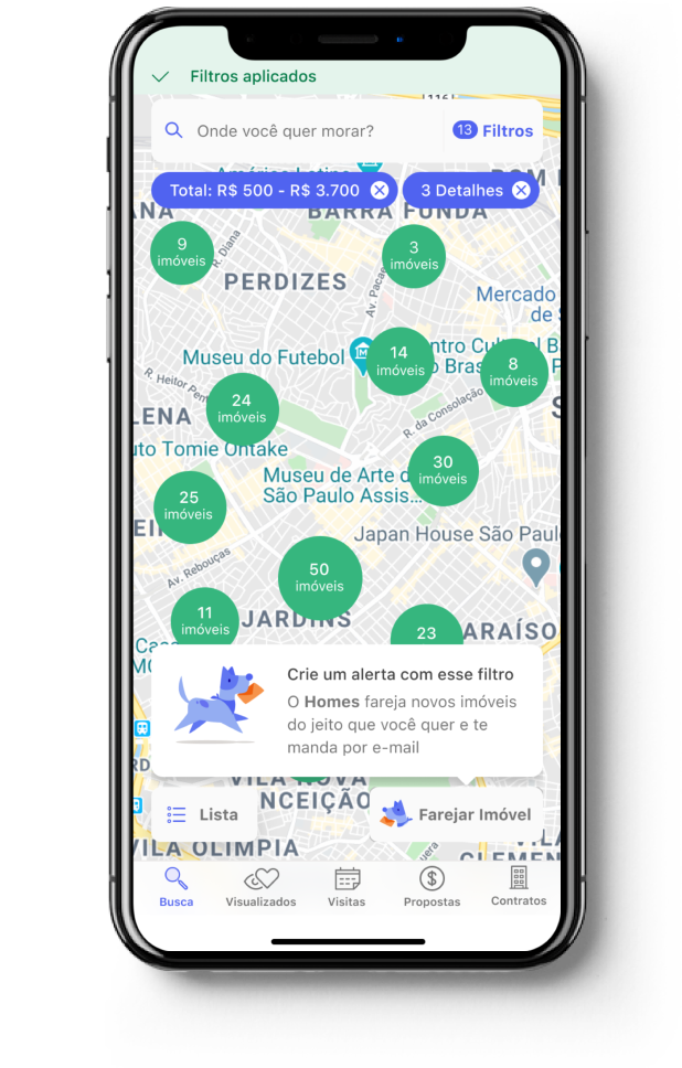
If we suggested users to create an alert right after they first apply a filter we would increase alerts creation and consequently, visit bookings.
Making the app accessible
In 2019, QuintoAndar started an internal movement to make its apps more accessible. Event tough accessibility should be considered from the beginning, we've found out that our app was not accessible for people blind using VoiceOver. We've run user tests with blind people and we even hired a blind QA tester to help us conform to accessibility guidelines.
- We've added proper description to abbreviations, for example, FRI was now properly described as Friday on VoiceOver.
- We've described the Number of selectable elements in a row, for example, days of the week
- We've described if the day was available for booking visits
- We've properly described buttons on the app
Learnings
- It was the first time I worked together a blind professional, and it made me realize how I could improve my design process thinking about accessibility
- I would have relied less on guerrilla tests and recruit better participants from the beginning.